
About Us / Brand Image (CIS)


Since the Foundation was established in 1996, nearly three decades have passed. Over the past ten years, our services—including the expansion of Papa’s Pad into New Taipei City and the steady growth of our Silver Fox Clubs—have continued to develop.
With this progression, it became increasingly clear that we needed a visual identity capable of fully reflecting the scope and spirit of the Foundation’s mission and services.
Our Primary Logo & CIS Overview
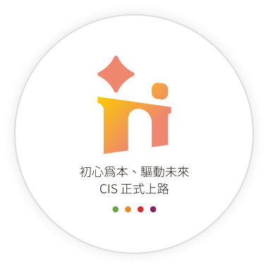
After extensive discussions, our new primary logo was created—featuring an orange-red diamond paired with a warm yellow circle above a gradient arc-shaped bridge.
Some see a torch, others see an adult and child holding hands, and still others recognize the symbolic “H” that represents our brand identity.
Design Concept: Vitality, Radiance, Warmth, and Well-Being
The logo integrates the guiding “North Star” and the radiant “torch,” using the “bridge” to connect people and convey a brand spirit of equality and mutual support. The incorporation of the brand initial “H” further strengthens visual recognition.
Its gradient colors express warmth and care, symbolizing human connection and creating a sense of belonging—like a home—where we journey together toward a brighter future.
CIS Enhancement for a Stronger Brand Identity
Following the launch of our new logo, we completed trademark registration and implemented a comprehensive Corporate Identity System (CIS). The visual identity has been extended to uniforms, business cards, official vehicles, classroom signage, and office environments, and applied across our website and social media platforms—presenting a unified and strengthened image of the Foundation.


 Design & Support by Surfing CloudWave Creative